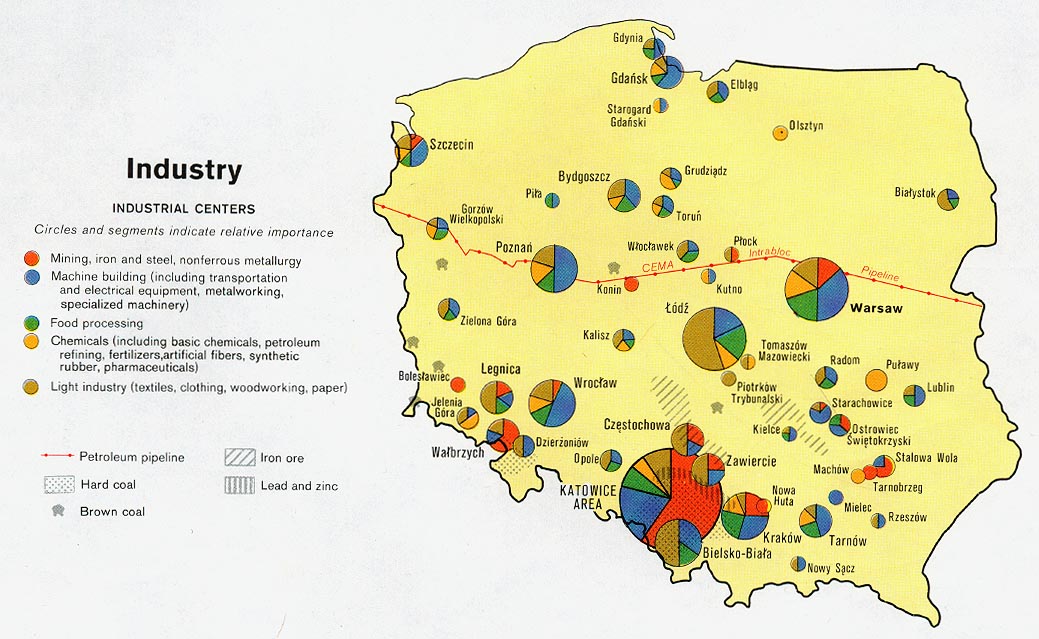
The above map uses pie chart symbols to represent five different types of industry. Source: http://www.lib.utexas.edu/maps/europe/poland_ind_1977.jpg

This map is a series that shows multiple data sets. The map would be very difficult to interpret if all of the data sets were plotted on one base map. Source:http://www.library.utexas.edu/maps/islands_oceans_poles/sri_lanka_charts_76.jpg
No comments:
Post a Comment