Wednesday, December 11, 2013

Top 10 Maps

Top 5 Student Lab Maps

(In no particular order)


 From Danielle: This map is very clean and crisp. The color choices work together well and the shifted symbol box adds a little something to the layout.


From Eric:  While it's not the most uplifting topic, it's a well done map. The symbol and font are both appropriate. The simpleness allows readers to focus on the data.


From James: This map definitely conveys that SMERG is BAD! The polluted city background adds a great touch. 

From Jared: I like the background and overall theme of the map. The font and color blocking work well together. 
From Rebecca:  This is a very well done bivariate map. The color ramp is easy to read, but my favorite part is the background. 

Top 5 Weekly Blog Maps

(in no particular order)


From Cory: Zoom in, if you can, the map was created using text and creates a casual feel.  


From Jennifer: What a beautiful map! The colors are so vibrant-- it reminds of me a Lite Brite.

From Thomas: At first glance, this doesn't even look like a map- it looks more like something organic. The colored contours are quite intense; I like it. 
From Nicole: The color of the dots are so vibrant- they work really well against the muted background. The projection helps show the zone of hurricane ranges. 
From Jon: This map is quite simply, but the data makes it amusing. The map shows where there are more bars or grocery stores. The yellow/orange is more grocery stores. 

Final Project


Above is the finished product for my final project. I chose to make a map of my neighborhood. There were a few challenges along the way: base map files, elevation, scale, and those darn trees! The two base map files I used were parcel and road edge line files imported from ArcGIS. Even though they came from the same data source- the edges did not line up; this resulted in me spending hours meticulously moving each road edge to line up with the parcel edges. Originally I intended to show the elevation within the neighborhood. Unfortunately, what I perceive as decent elevation changes is not enough for ArcGIS's interpolation tools to show any change within my neighborhood. So you'll just have to take my word for it: the neighborhood is not flat. Basically, wherever you see trees is where there are steep slopes. Do you see my inset map? I wanted to make that the larger map and show some of the nearby amenities. After some debating (with myself) and some helpful feedback from my peers, I arrived at the final layout instead. Those trees crashed my computer many times, I'll leave it at that.

   Overall, I'm quite pleased with how the map turned out.


Tuesday, November 19, 2013

Bivariate Map Examples


The above map uses pie chart symbols to represent five different types of industry. Source: http://www.lib.utexas.edu/maps/europe/poland_ind_1977.jpg


This map is a series that shows multiple data sets. The map would be very difficult to interpret if all of the data sets were plotted on one base map. Source:http://www.library.utexas.edu/maps/islands_oceans_poles/sri_lanka_charts_76.jpg

Monday, November 11, 2013

Female Population of West Virginia


Density Map of Every Geotagged Wikipedia Article


The above image is an example of a dot density map. Each yellow dot in the map above represents one geotagged article (in English) on Wikipedia. The source website produced several of these maps that show data for different languages used.
Source: http://www.theguardian.com/news/datablog/2011/nov/11/wikipedia-map-world-languages

Thursday, November 7, 2013

Final Project Proposal


  Another course I’m enrolled in this semester is GGS 380: Geography of Virginia. In the course, there is an ongoing assignment that requires students to write weekly field trip reports for a specific site. For my site, I chose my neighborhood: Cardinal Crest subdivision in Woodbridge, Virginia. Some of the topics discussed this far were geology, hydrology, natural areas, transportation, and settlement patterns. In each of my site reports, there’s usually at least one map. The maps aren’t necessarily the best they can be. I’ve often had to rely on Google Maps or the Prince William County mapper, and then adding my own “sophisticated graphics,” as witnessed below.
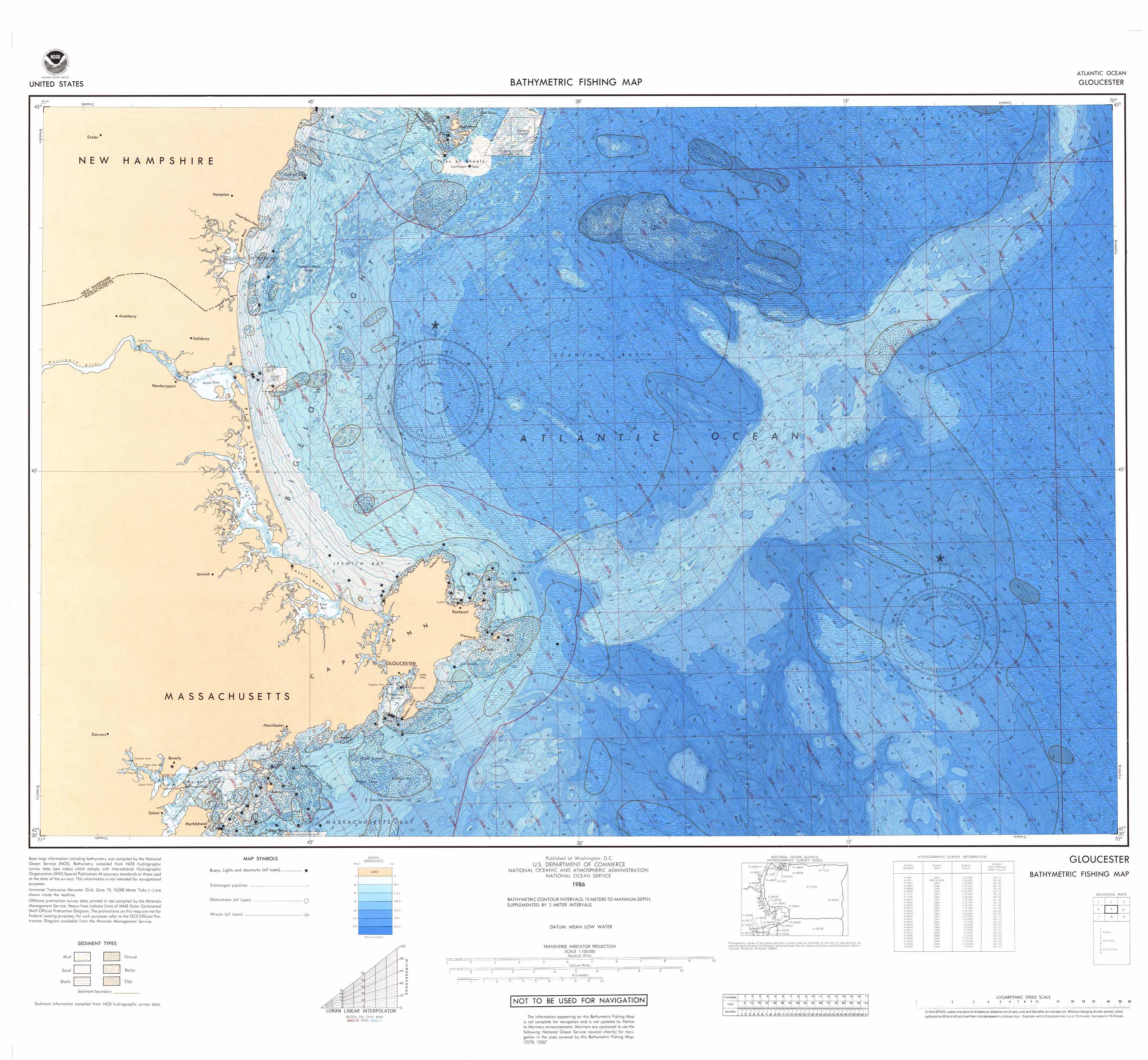


  The two maps above show the elevation through the use of contour lines. The downside is that they are a pain to interpret! Look at Figure 2 (from the Prince William Mapper); while it’s nice to see the contours overlaying the aerial imagery, the map seems cluttered (and has bad labeling). Figure 3 (from USGS) is cleaner, but it’s still difficult to find the exact elevation for a specific point. I’m used to topographical maps having a bold contour line every ____ intervals; neither map has that interpretation aid. Another issue I've encountered when searching for maps is that, at the scale I need, labels are sometimes nonexistent.

   As our final project for that course, we will be combining all of our site reports into one neighborhood profile report.  I want to create a map of the neighborhood.   The intended purpose of this map is to be an all-inclusive reference map for Cardinal Crest subdivision. While the final product will be used in another project, residents within the neighborhood may find the map useful. When my family decides to sell our home, the map could be provided along with other household documents that will familiarize the new owners with the area.

  My neighborhood is actually connected to two other neighborhoods, and all three neighborhoods will be included in the map. There are several features that will be included, at a minimum: elevation, common areas, water features, roads, and sidewalks.  Other features could be school locations, wooded areas, property lot boundaries, parks, and certain retail establishments (like gas stations or grocery stores). Because of the amount of data associated with Cardinal Crest that I want to display, I’m considering doing a smaller scale map (to show features outside of the neighborhood) accompanied by a large scale map to show details inside the neighborhood.

   The obvious first step is gathering all of my required data. The base map will likely be a road map imported from ArcGIS. ArcGIS Online will be my primary data source, in addition to the stockpile of GIS data I already have. Prince William County’s GIS department would be a logical data source; however I would rather not pay for data.


    Because the use of standard contour lines on my example maps is so difficult to interpret, hypsometric tints would be used on my map. One of major design decisions to make is to determine what features should be displayed on each map. I would like to be able to show elevation contours and wooded areas on the same map. While I would prefer to show wooded areas using polygons, it would make the map messy and cover up the elevation layer underneath. The best solution would be to use physiographic symbols to represent wooded areas.  

The above image is an inspirational map for this assignment. Source: http://www.stone-crossing.com/images/03-06update/wood_sc_neighborhood_map4.jpg

Tuesday, October 29, 2013

Bathymetric Fishing Map


The above map is a bathymetric fishing map created by the National Oceanic and Atmospheric Administration. This is an example of an isoline map. The contours represent the different water depths.

Source: http://www.ngdc.noaa.gov/mgg/image/nosfish200203_100dpi.jpg

Tuesday, October 22, 2013

Tornadoes in Maryland: Symbols


Color Map


The above map from NASA shows the tectonic activity of the Earth. Its use of color is actually quite constrained, which allows for easier readability. Only three symbol colors are used, so it's difficult to get confused. The subtle gray background makes the colors pop while still showing topographic relief.

Source: http://core2.gsfc.nasa.gov/dtam/images/tectonic_map.jpg

Wednesday, October 16, 2013

Here Comes the Color....Owner Occupied Housing Units


The most obvious difference between the web version above and the printed version of my map is the saturation and vividness of the colors. Instead of the 71.4-74.6% class (the darkest) appearing as a deep magenta/berry/fuchsia type color, the printed version is a muted reddish burgundy. The intense purple hue that is present in the web version is absent on paper. The fourth class of colors (69.7-71.2%) is muted as well. The paper version's colors appear flat and, despite being bright colors, somewhat blah.

Monday, September 16, 2013

Mollweide Graticule


The Mollweide Graticule projection is a "pseudo cylindrical equal-area porjection with straight and elliptical meridians; it was first presented by Carl Mollweide in 1805." (Jill Hallden)

Thursday, August 29, 2013

The Most Popular New Cars by State


 When I travel throughout the country, I like to make note of what cars are popular in each location. I'm originally from Michigan and the majority of cars on the road are domestics, so it's no surprise that the Ford Escape was the most popular. My mother recently purchased a Toyota Rav-4 and remarked how easy it is to find her car in parking lots because they are relatively rare in her area. I had to laugh at her- I can't seem to throw a rock without hitting a Rav-4 here in Northern Virginia.

Here's the original source for the map: http://jalopnik.com/these-are-the-most-popular-new-cars-in-each-state-586657057