Wednesday, December 11, 2013

Top 10 Maps

Top 5 Student Lab Maps

(In no particular order)


 From Danielle: This map is very clean and crisp. The color choices work together well and the shifted symbol box adds a little something to the layout.


From Eric:  While it's not the most uplifting topic, it's a well done map. The symbol and font are both appropriate. The simpleness allows readers to focus on the data.


From James: This map definitely conveys that SMERG is BAD! The polluted city background adds a great touch. 

From Jared: I like the background and overall theme of the map. The font and color blocking work well together. 
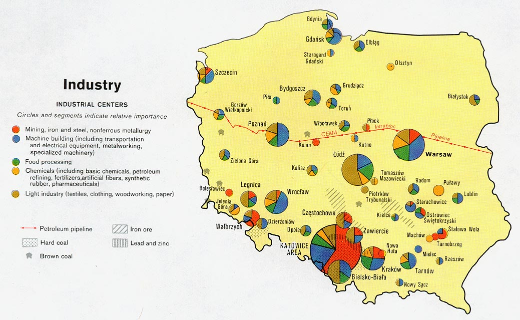
From Rebecca:  This is a very well done bivariate map. The color ramp is easy to read, but my favorite part is the background. 

Top 5 Weekly Blog Maps

(in no particular order)


From Cory: Zoom in, if you can, the map was created using text and creates a casual feel.  


From Jennifer: What a beautiful map! The colors are so vibrant-- it reminds of me a Lite Brite.

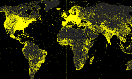
From Thomas: At first glance, this doesn't even look like a map- it looks more like something organic. The colored contours are quite intense; I like it. 
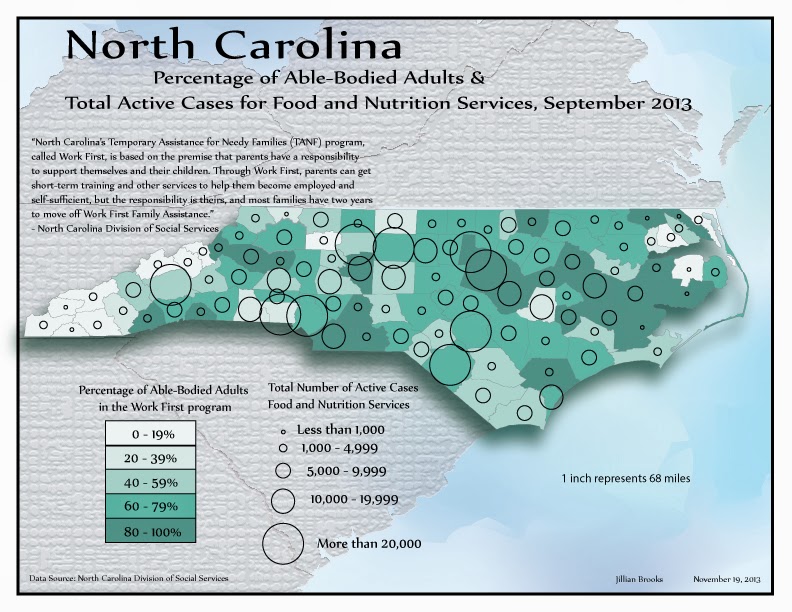
From Nicole: The color of the dots are so vibrant- they work really well against the muted background. The projection helps show the zone of hurricane ranges. 
From Jon: This map is quite simply, but the data makes it amusing. The map shows where there are more bars or grocery stores. The yellow/orange is more grocery stores. 

Final Project


Above is the finished product for my final project. I chose to make a map of my neighborhood. There were a few challenges along the way: base map files, elevation, scale, and those darn trees! The two base map files I used were parcel and road edge line files imported from ArcGIS. Even though they came from the same data source- the edges did not line up; this resulted in me spending hours meticulously moving each road edge to line up with the parcel edges. Originally I intended to show the elevation within the neighborhood. Unfortunately, what I perceive as decent elevation changes is not enough for ArcGIS's interpolation tools to show any change within my neighborhood. So you'll just have to take my word for it: the neighborhood is not flat. Basically, wherever you see trees is where there are steep slopes. Do you see my inset map? I wanted to make that the larger map and show some of the nearby amenities. After some debating (with myself) and some helpful feedback from my peers, I arrived at the final layout instead. Those trees crashed my computer many times, I'll leave it at that.

   Overall, I'm quite pleased with how the map turned out.


Tuesday, November 19, 2013

Bivariate Map Examples


The above map uses pie chart symbols to represent five different types of industry. Source: http://www.lib.utexas.edu/maps/europe/poland_ind_1977.jpg


This map is a series that shows multiple data sets. The map would be very difficult to interpret if all of the data sets were plotted on one base map. Source:http://www.library.utexas.edu/maps/islands_oceans_poles/sri_lanka_charts_76.jpg

Monday, November 11, 2013

Female Population of West Virginia


Density Map of Every Geotagged Wikipedia Article


The above image is an example of a dot density map. Each yellow dot in the map above represents one geotagged article (in English) on Wikipedia. The source website produced several of these maps that show data for different languages used.
Source: http://www.theguardian.com/news/datablog/2011/nov/11/wikipedia-map-world-languages