Tuesday, October 29, 2013

Bathymetric Fishing Map


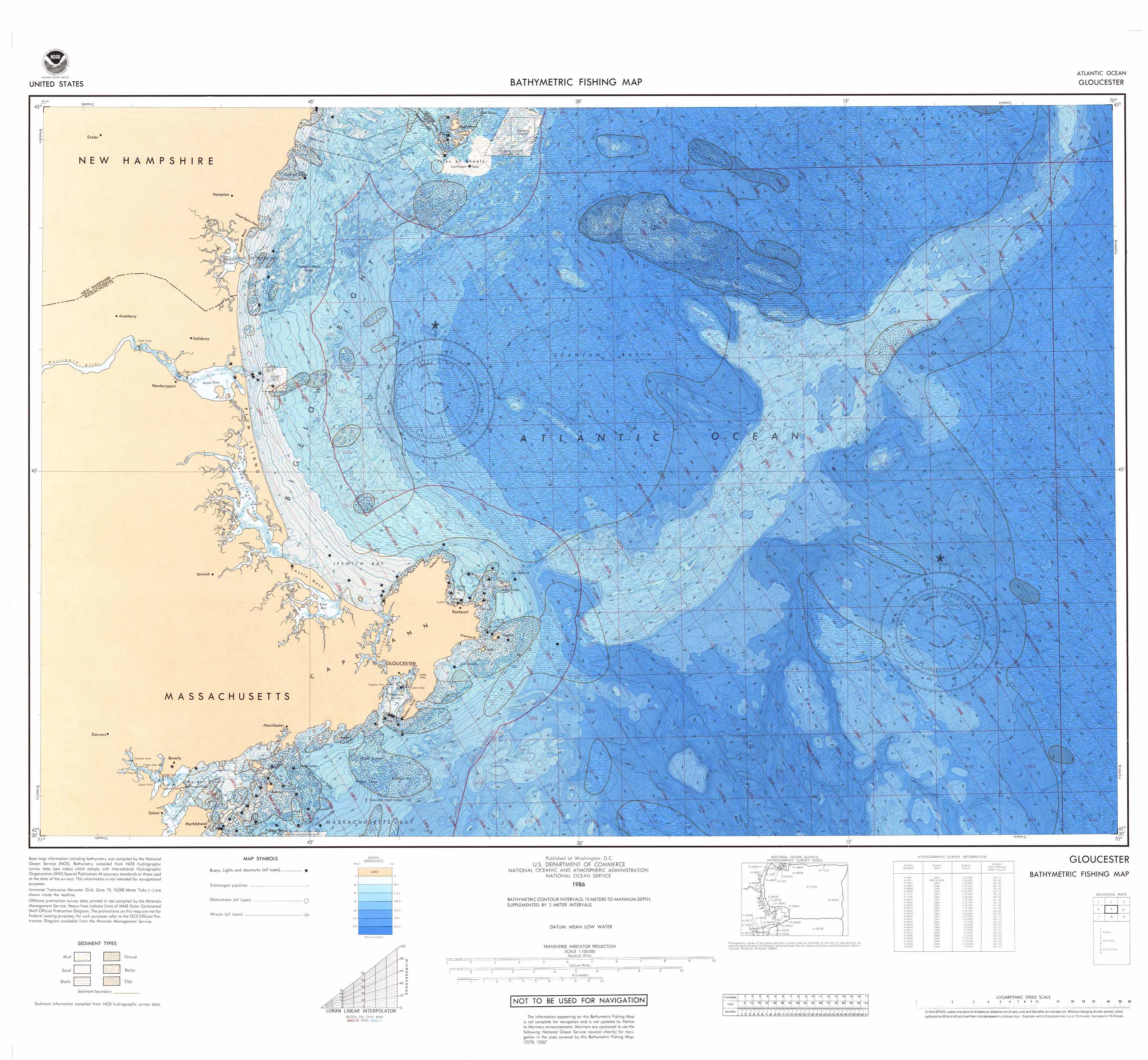
The above map is a bathymetric fishing map created by the National Oceanic and Atmospheric Administration. This is an example of an isoline map. The contours represent the different water depths.

Source: http://www.ngdc.noaa.gov/mgg/image/nosfish200203_100dpi.jpg

Tuesday, October 22, 2013

Tornadoes in Maryland: Symbols


Color Map


The above map from NASA shows the tectonic activity of the Earth. Its use of color is actually quite constrained, which allows for easier readability. Only three symbol colors are used, so it's difficult to get confused. The subtle gray background makes the colors pop while still showing topographic relief.

Source: http://core2.gsfc.nasa.gov/dtam/images/tectonic_map.jpg

Wednesday, October 16, 2013

Here Comes the Color....Owner Occupied Housing Units


The most obvious difference between the web version above and the printed version of my map is the saturation and vividness of the colors. Instead of the 71.4-74.6% class (the darkest) appearing as a deep magenta/berry/fuchsia type color, the printed version is a muted reddish burgundy. The intense purple hue that is present in the web version is absent on paper. The fourth class of colors (69.7-71.2%) is muted as well. The paper version's colors appear flat and, despite being bright colors, somewhat blah.